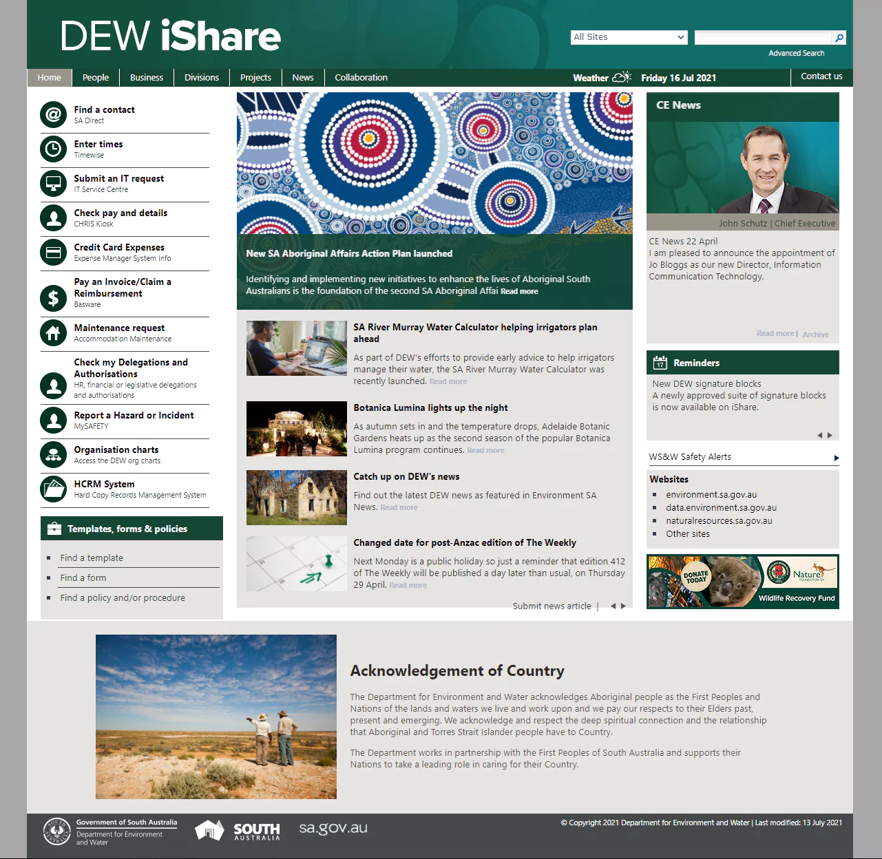
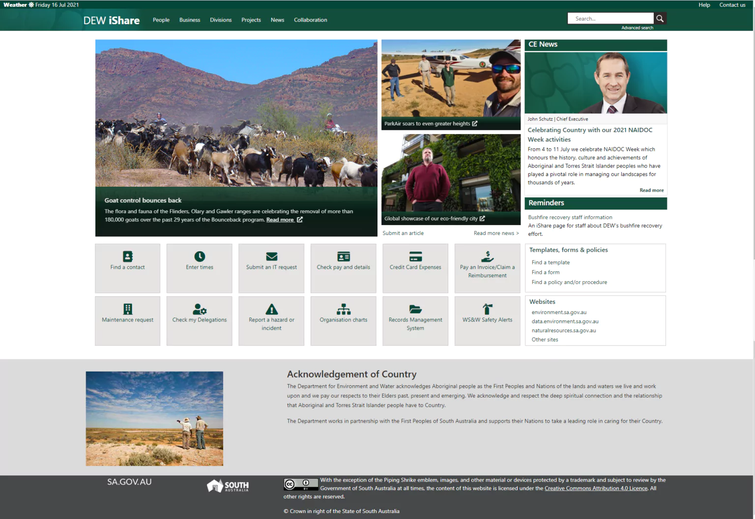
Platform upgrade of Microsoft SharePoint.
The before and after
Tools
- Balsamiq Mockup Tool
- Adobe XD
- Visual Studio Code
- Bootstrap CSS Framework
My Role
- UX research
- UI design
- Data migration
- Front-end web development
Timelines
- Overall: 8+ weeks
- Discovery & Research: 2+ weeks
- Development & testing: 6 weeks
The problems
- Applications lacked cross web browser compatibility
- UI does not adapt to different screen sizes
- Not meeting WCAG 2.0 criteria
- Global navigation was highly customised and over-engineered
- UI branding solution relied on SharePoint 2010 theming engine and was not supported in future versions

The solutions
- Use Term Store Metadata to build Global Navigation
- Implement a responsive framework
- Introduce Accessibility and cross-browser test plan
- Future-proof by moving away from customized components to extending out-of-box elements
- Made improvements to the management of online data and page layouts

Some Highlights
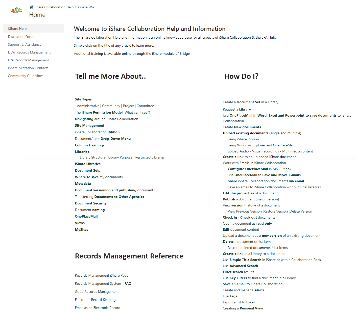
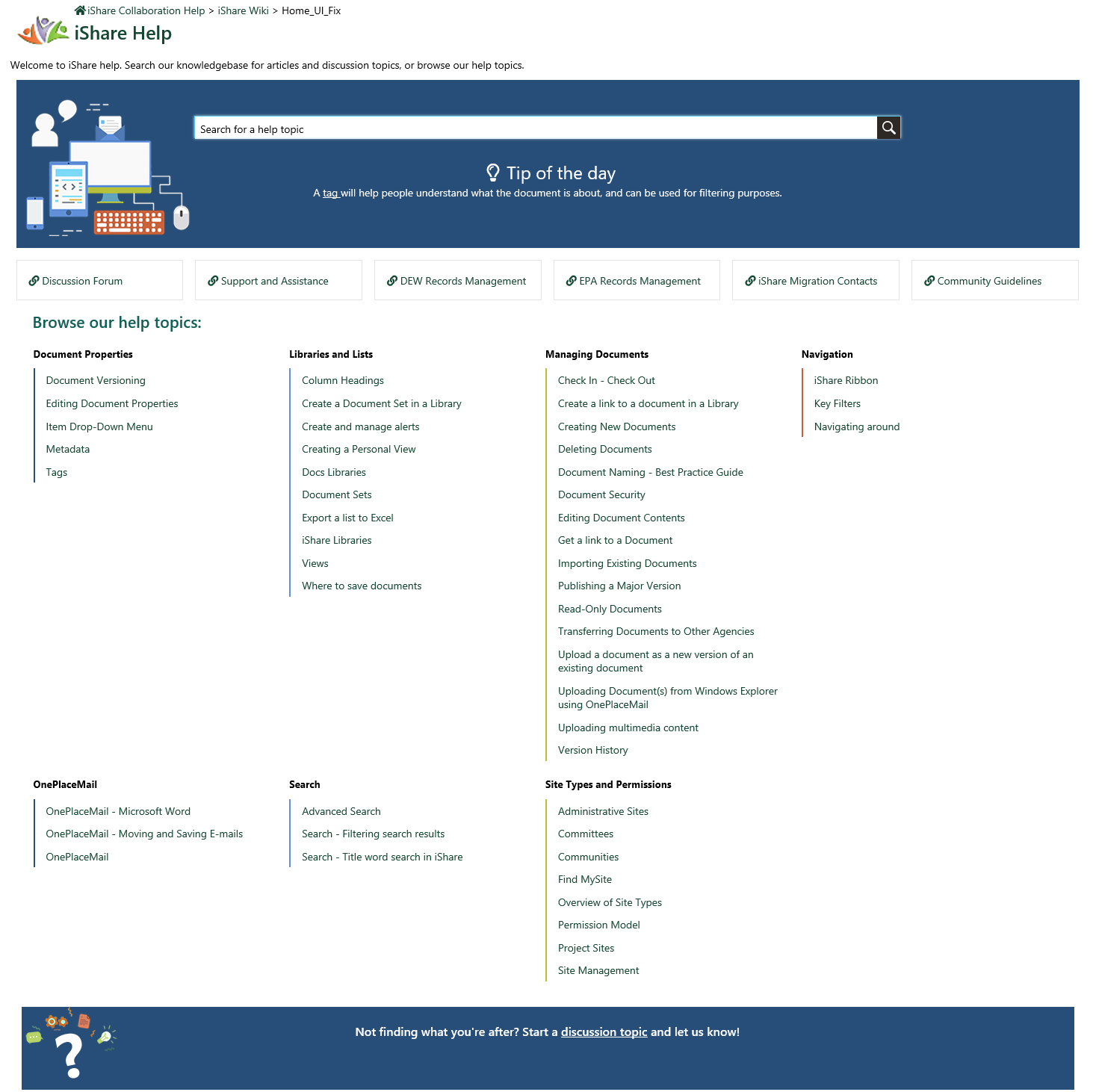
Intranet knowledge base design and development
The problem
- Help page was wall of unreadable text
- Stats showed a high bounce rate on this page
- Customers were unable to find help articles
- Maintaining help articles was difficult, and required manual intervention to display the link on the landing page

The solution
- Designed a clean, scannable, searchable page
- Move away from manually updates to the landing page, to using data-generated content
- Added metadata to existing help articles for group, and category
- Extended a Content Query Webpart, that takes the title of an article and groups them by their category, and displays the content on the page
- Added a ‘Tip of the day’, which randomly selects an article each day to feature
